For the Bally Hike capsule collection, made in collaboration with Robert Rabensteiner, we developed the concept – Hike Everywhere.
Hike everywhere is a scalable concept which has been delivered globally from Pop-ups in New York and Beijing to flagship installations in London, Milan & Seoul to name a few.
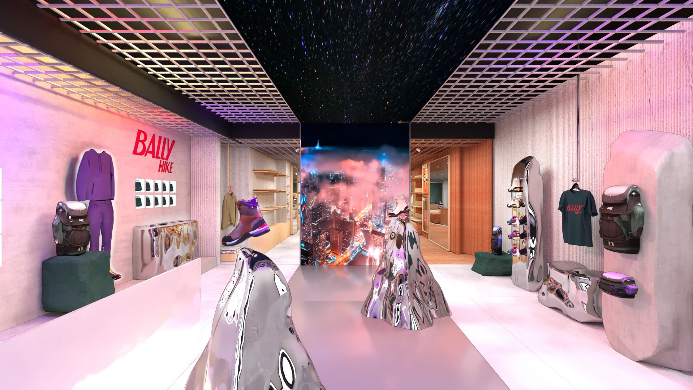
The concept of Hike everywhere bridges the light, reflections and distortions that nature has on our cities and landscapes. From fog and rain which diffuses and reflects lights in the city, to the luscious greenery of rainforests meeting the morning mist. The concept plays with how we perceive the natural elements and the man-made and playing with the layered distortions created when combined.
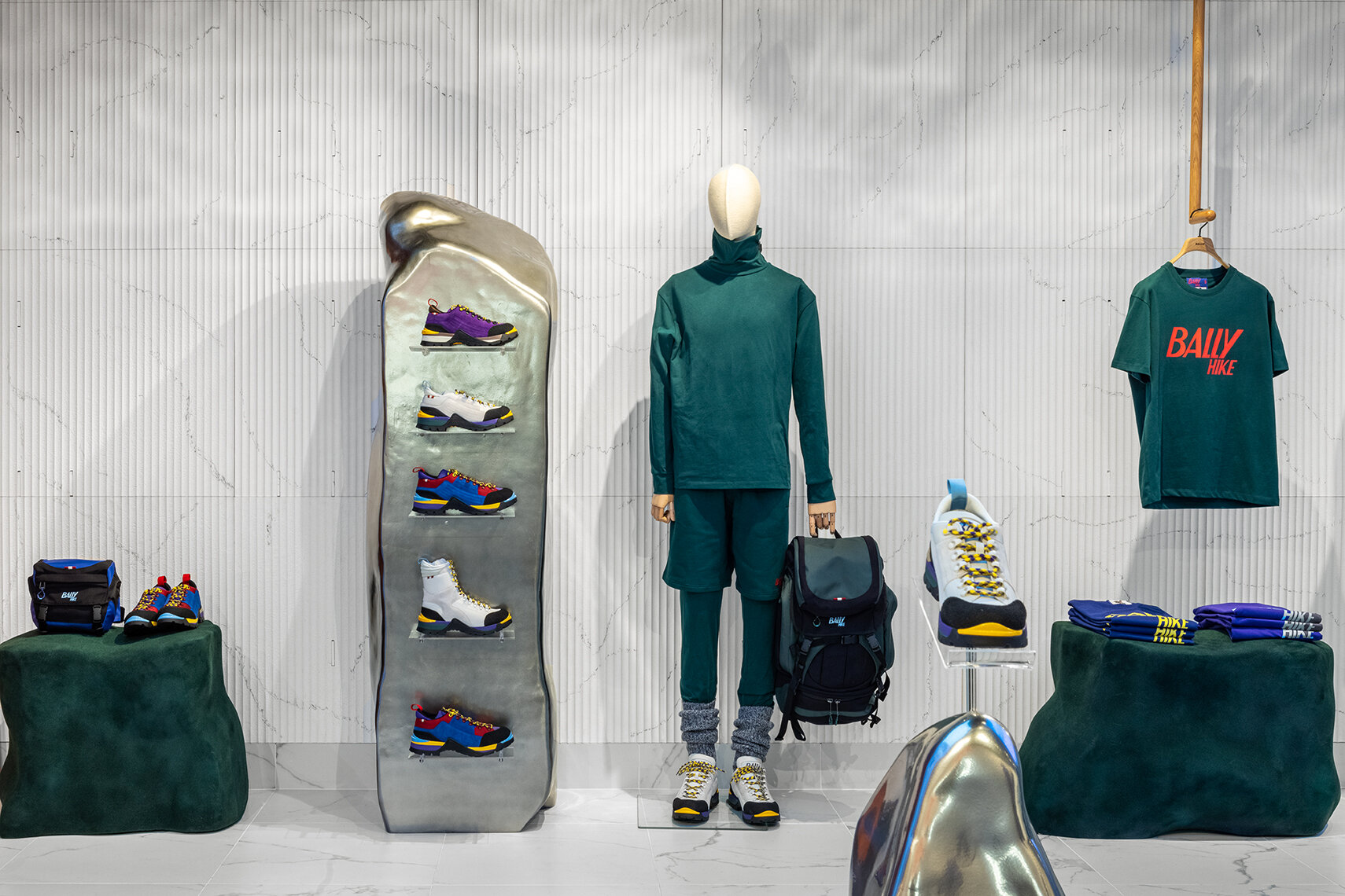
Elements of the design featured chromed sculptures depicting rock formations or mountain peaks – a nod to Bally’s outdoor influence but with a contemporary twist. These reflected the campaign colours and their surroundings through different facets of the sculpture forms – from motion screens and lightboxes in close proximity to surrounding textures, the sculptures would give a dynamic perspective while you move through the space.
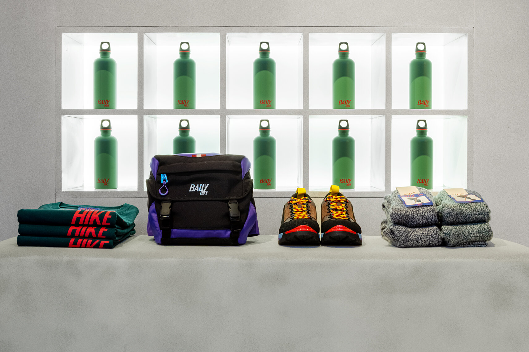
Flocked forms in stone and green tones took inspiration from nature and formed to create plinths and merchandise walls for a range of products. To larger installations, mist textured windows would give blurred out distortions of light and colour while giving apertures to key content and the iconic Bally Hike signage.

CLIENT: BALLY
WHAT WE DID: RETAIL DESIGN
LOCATION: WORLDWIDE
COLLABORATORS: ROBERT RABENSTEINER
SEEN IN: FASHION UNITED, RETAIL FOCUS
PROCESS: CONCEPT CREATING, DESIGN, PRODUCTION CONSULTING


